
Responsive Table with CSS & Javascript
The reason I created this example was that I needed to quickly find a solution to display a table more efficiently on a smaller screen. This is a Javascript approach to responsive tables with column headings like the css version in this article: https://css-tricks.com/responsive-data-tables/
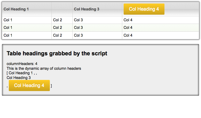
The difference here is the added Javascript function pulls column headers into table cells so you aren’t setting the mobile labels in the css.
The breakpoints are set in the css.
- Table min-width = 320px. This can be changed/removed via css.
- Mobile view breakpoint at 768px. This can be changed via css.

The codepen below isn’t able to be resized in order to be able to test the breakpoints, but if you click over to the codepen site with the link in the upper right of the codepen window you will be able to play with the width of the table. Right now it is only showing the small screen sized view.
See the Pen Responsive Table with CSS & Javascript by Joe Zimmerman (@stantonl33) on CodePen.0